

Theories
They can't all be wrong...
A group of young conspiracy theorists risk everything to uncover the truth.
London, ON | Suspense, Horror
289 Followers
Mission #3: Poster
See Mission Brief


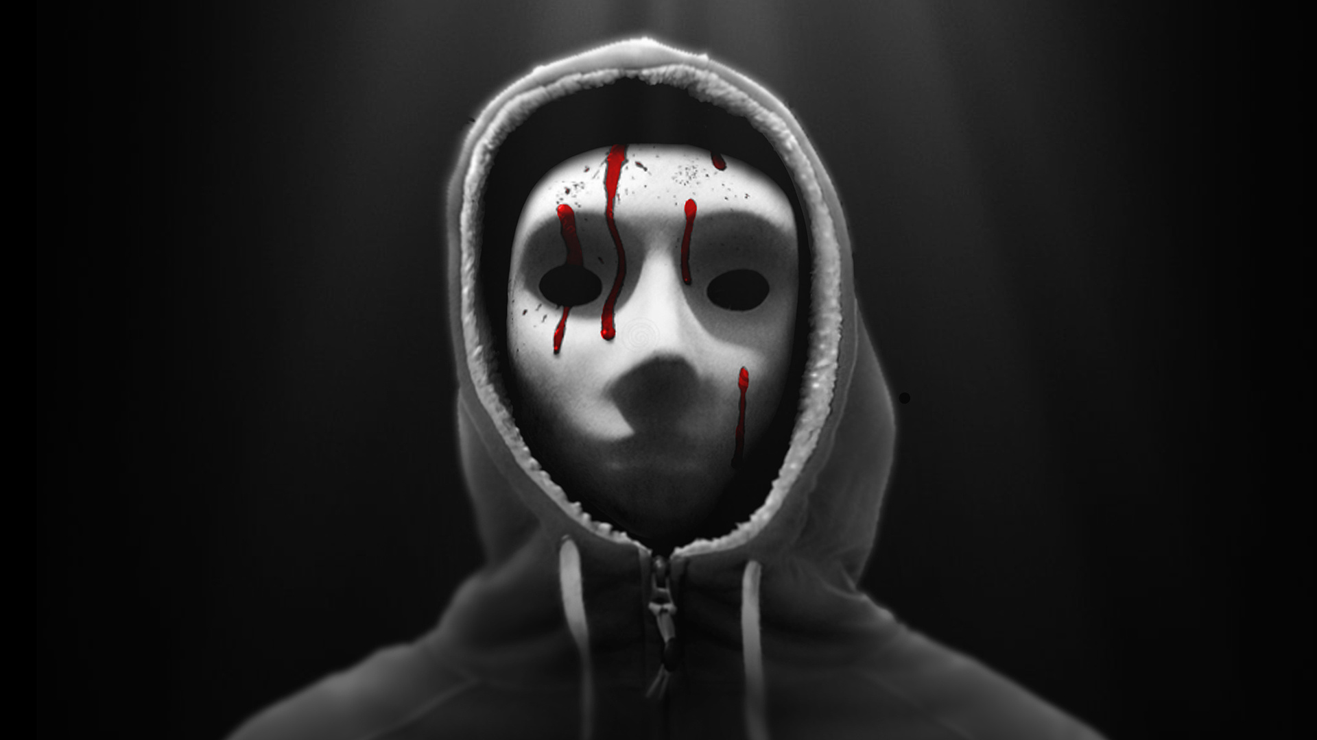
Poster 1


Missions

Mission #1 Trailer

Mission #2 Differentiator

Mission #3 Poster

Mission #4 Speechless

Mission #5 Conceptualize

Mission #6 Another Angle

Mission #7 Hype

See Top 15

Mission #9 Franchise

Mission #10 Roast
See Final 5

Mission #12 The Big Deal

The Last Canadian

Generation O

Black Land

Edith

High School Brawl

New Ventry

Arcade Death Zone

Checked In

Frackin' Zombies!

Sassquatch: Return of the Queen

Tales From The Castle Of Terror

Colt

Hellmington

Psychonaut

Earthlickers

The Wounded

Comic Book Wednesday

Blood White

Human Oil

A Western

Astral Haven

Across All Galaxies

Postmen

Hypnotica The Nightmarist

Playground Rules

Can Con

Advanced Wizards And Warriors

Melvin and Tyler

Climax

Camp Death III: The Final Summer

Pretty. Ugly.

Love at First Stab

Scum City

Seth

Primordia

The Legend of Davy Crockett

Nerd Nite

Scales

Chrome Steel

DJ Duppy - The Reggae Zombie

Cognition

Fish Eye

Wasted

The Cowboy

Hyde and Seek

People for the Ethical Treatment of Zombies

Pestis

Blurry Bits

Nowhere Fast

The Sad Prince

Gauntlet

Golden Bros.

Lucidity

Henchmen

Cupid

Collider

Goons

Wedding Season

The Necroslinger

Patient 62

Fantome

Baby Face

Namas-DIE

Enthralled

The Visitor

Sweetblood

John Goes To The Olympics

Belushi's Toilet

The Adventures of Porno the Clown

The Slinger

Comments (60)
I liked Poster A better. It has a better flair that draws conspiracy theory fans.
Poster A is creepy and striking. If i saw this cover at Blockbuster back in the day, it'd definitely be something id rent lol.
Cheers
Lovina
I picked Poster B. 26% of the vote.
Poster A
Artistically, I like poster B with the girl. Great lighting, textures, and expression. The red in the title is great and helps to tie in the mask # hashtag. Not sure about the solid red mask but I can't suggest anything different. Oddly, I picked poster A . It had more of an immediate appeal. I might have to work out why in therapy. Best of luck to you!
The idea of the mask is obviously showing that there is something that is hiding. But man, I have seen that same style mask used in 4 or different projects.
This images creep me out, you've truly done it! Keep working the horror edge will get you far but make sure you don't over do it as to make it cliched.
Pretty scary, should be a great thriller!
The use of the colour red in poster B and the human face in the foreground make this poster work better for me.
Definitely poster "A" is much scarier than poster B. Good job, congratulations on top 60. Looking forward to seeing next missions.
Report Comment
You are about to report a violation of our Terms of Service. All reports are strictly confidential.
We will NOT remove comments just because you disagree with the statement being made.
Reason for reporting*